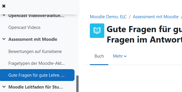
could it be fruitful to discuss some of the Boost Union issues/feature wishes that somehow fell down behind a little bit but still are worth thinking about? In a recent exchange organized by the Moodle NRW (re configuration of BU) somebody addressed that BU is a theme that adds a lot of useful functionality but doesn't address design issues in the first place. I think this is subject to interpretation of the term design, but I have had a look through the open and not yet assigned to anybody issue / feature request list on github and found that the following #s imho do address important ux design questions i.e. regarding the UX of navigating through the system, including the functionality around icons, since these are primarily used to identify activities while navigating.
All of this bearing in mind that the following smart menus and menu bar features are already financed and on their way to be finished by the bdecent team.
Feature: Smart menus
https://github.com/moodle-an-hochschulen/moodle-theme_boost_union/issues/136
Feature menu bar
https://github.com/moodle-an-hochschulen/moodle-theme_boost_union/issues/137
But there is then maybe a lot to close once that's there and the fewer aspects remain to be done
Issues all around navigation
Sticky secondary navigation (waiting for core fix)
https://github.com/moodle-an-hochschulen/moodle-theme_boost_union/issues/1
Feature: Allow admins to customize the course navigation
https://github.com/moodle-an-hochschulen/moodle-theme_boost_union/issues/8
--> covered by 137
Feature: Allow admins to customize the global navigation
https://github.com/moodle-an-hochschulen/moodle-theme_boost_union/issues/9
--> covered by 137
Feature: Lecture term based course navigation
https://github.com/moodle-an-hochschulen/moodle-theme_boost_union/issues/10
--> covered by 137
Feature: Allow admins to change the course settings menu
https://github.com/moodle-an-hochschulen/moodle-theme_boost_union/issues/13
--> covered by 137
Feature: Filter courses in navigation panel
https://github.com/moodle-an-hochschulen/moodle-theme_boost_union/issues/93
--> covered by 137&136
Feature: Display activity icons in course content navigation
https://github.com/moodle-an-hochschulen/moodle-theme_boost_union/issues/16
This has to be solved by an interface designer I think, because Moodle uses the course index for the display of the activity completion status, so the two would have to be displayed in a meaningful way. (e.g. icon left, status right ...?)
Feature: Direct link to selecting default language to the language menu
https://github.com/moodle-an-hochschulen/moodle-theme_boost_union/issues/128
Feature: Improve usability of course management page
https://github.com/moodle-an-hochschulen/moodle-theme_boost_union/issues/129
Improvement: Add "collapse all" and "expand all" links to the course index drawer
https://github.com/moodle-an-hochschulen/moodle-theme_boost_union/issues/187
Bug: The edit button widget breaks with really long site names
https://github.com/moodle-an-hochschulen/moodle-theme_boost_union/issues/256
Bug: Dark navbar hides notification menu buttons
https://github.com/moodle-an-hochschulen/moodle-theme_boost_union/issues/273
Issues addressing not strictly navigational but still basic design questions that affect the use of real estate, and proportions
Feature: Allow admins to customize the look and feel with admin settings instead of just custom CSS
https://github.com/moodle-an-hochschulen/moodle-theme_boost_union/issues/11
Proposal: Streamlining of content width sizing
https://github.com/moodle-an-hochschulen/moodle-theme_boost_union/issues/18
Feature: Smaller headline on small devices
https://github.com/moodle-an-hochschulen/moodle-theme_boost_union/issues/68
Feature: Block drawer width
https://github.com/moodle-an-hochschulen/moodle-theme_boost_union/issues/74
Feature: Setting for the activity icon size
https://github.com/moodle-an-hochschulen/moodle-theme_boost_union/issues/76
Feature: Course layout
https://github.com/moodle-an-hochschulen/moodle-theme_boost_union/issues/135
Proposal: Streamlining of block width and content width on help.php
Unfortunately I am neither a developer, nor present at the Zürich event, but maybe the list helps a little to cluster the load of issues on the BU planet a little bit. Looking forward to your comments and ideas about this!
Regards from H
Wiebke

