Hi Katarzyna,
thank you for your reply - you are absolutely right. I'd go for this one - since I think it is a true interface design challenge that has to be done first and some prototyping and quick UX testing would be feasible on site...
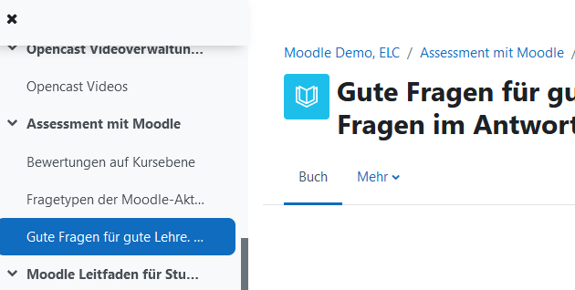
This has to be solved by an interface designer I think, because Moodle uses the course index for the display of the activity completion status, so the two would have to be displayed in a meaningful way. (e.g. icon left, status right ...?)
thank you for your reply - you are absolutely right. I'd go for this one - since I think it is a true interface design challenge that has to be done first and some prototyping and quick UX testing would be feasible on site...
Feature: Display activity icons in course content navigation
https://github.com/moodle-an-hochschulen/moodle-theme_boost_union/issues/16This has to be solved by an interface designer I think, because Moodle uses the course index for the display of the activity completion status, so the two would have to be displayed in a meaningful way. (e.g. icon left, status right ...?)
Just to point to the enhancement for a foreseeable in-course navigation UX I see here:
Wouldn't it be great for the user to know he or she will land in a book before he or she clicked on the link in the course index?

I have absolutely no idea, what the effort would be in coding, but I'll try and find some stakeholders, since I unfortunately won't be able to come to your beautiful city.
Regards from another beautiful city
Wiebke
Regards from another beautiful city
Wiebke
